Search Engine Optimization (SEO) is notoriously complex. It is a discipline where art meets science, and where technical code intersects with human psychology. For many marketers and business owners, trying to digest the thousands of Google algorithm updates and best practices through text alone can feel like reading a dictionary in a foreign language.
That is why visuals are so powerful. The human brain processes visual information 60,000 times faster than text. When you are trying to understand the architecture of a website or the flow of link equity, a single image can often convey what 2,000 words of text struggle to explain.
This guide isn’t just another long-winded manual. Instead, think of it as a curated visual library. We have broken down the vast world of search into 10 essential themes, using the concept of SEO infographics to simplify the most critical rankings factors for 2026. Whether you are a visual learner, a busy marketing manager, or a beginner trying to grasp the basics, these breakdowns will help you understand the strategy at a glance.
Below, we explore the essential charts, diagrams, and visual maps that define modern SEO success.
Part 1: The Foundation (Beginner Visuals)
Before you can rank for competitive keywords, you need a solid understanding of how search engines actually function. These foundational concepts are best understood visually, as they deal with the structure and ecosystem of the web.
Infographic #1: The Periodic Table of SEO
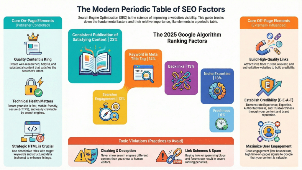
Just as chemistry has a periodic table of elements, SEO has its own table of success factors. A great “Periodic Table of SEO” SEO Infographics typically breaks down ranking signals into distinct categories, assigning them “weights” or importance levels.
Key Takeaway: The Balance of On-Page vs. Off-Page
The most critical lesson from this visual is the distinction between factors within your control and those outside of it.
- On-Page Elements (The “Internal” Elements): These are the tiles on the table representing things you can change immediately. They include your content quality, keyword research, HTML architecture, and site speed. In 2026, content freshness and E-E-A-T (Experience, Expertise, Authoritativeness, and Trustworthiness) occupy the heaviest sections of this table.
- Off-Page Elements (The “External” Elements): These elements represent how the rest of the web perceives you. Backlinks, social reputation, and brand mentions fall here. You cannot edit these directly; you must earn them.
- The “Toxins”: A good periodic table also warns you of the negatives black hat techniques like cloaking or keyword stuffing that can poison your rankings.
Infographic #2: How Google Works
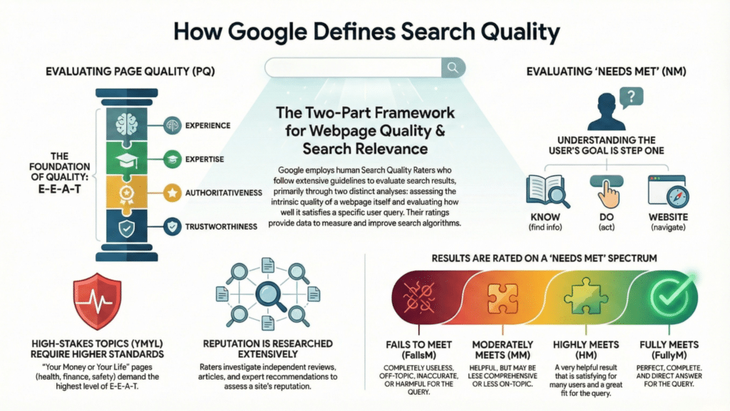
Understanding the journey of a webpage from publication to the search results page (SERP) is vital. This process is often visualized as a pipeline or a funnel.
Key Takeaway: The Crawling Indexing Ranking Pipeline
Many beginners mistake “indexing” for “ranking,” but this visual clarifies the difference.
- Crawling: This is the discovery phase. Google’s spiders (bots) follow links to find your content. If your site structure is poor (a “dead end” in the visual), the crawler stops, and your page is never found.
- Indexing: Once found, the page is analyzed and stored in Google’s massive library (the index). The infographic usually highlights that “noindex” tags or password-protected pages block this step completely.
- Ranking: This is the final step where the algorithm sorts the indexed pages based on relevance to a user’s query. The visual takeaway here is that you cannot rank if you haven’t been indexed, and you won’t be indexed if you haven’t been crawled.
Infographic #3: The Anatomy of a Perfectly Optimized Page
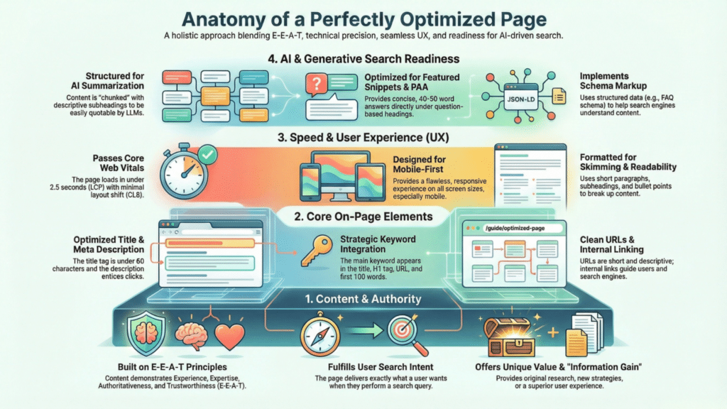
If you were to X-ray a high-ranking webpage, what would you see? This infographic serves as a blueprint for on-page SEO, pointing out exactly where keywords and semantic terms should live.
Key Takeaway: Strategic Placement, Not Stuffing
A perfectly optimized page isn’t about repeating a keyword 50 times. It is about placing the right signals in the right HTML tags.
- Title Tags and H1s: The visual blueprint shows the primary keyword appearing early in the Title Tag (the clickable link in search results) and the H1 (the main headline on the page).
- URL Structure: It highlights clean, descriptive URLs (e.g.,
domain.com/seo-tips) versus messy ones (e.g.,domain.com/p=123). - Image Alt Text: The diagram points to images, reminding you that search engines “see” images through text descriptions.
- Internal Linking: It shows links connecting to other relevant pages on your site, which helps distribute authority.
Part 2: Strategy & Content (Growth Visuals)
Once the foundation is set, you need a strategy to grow traffic. These concepts move away from technical structure and focus on user psychology and content planning.
Infographic #4: The Keyword Research Funnel

Not all keywords are created equal. A “Keyword Research Funnel” visualizes the difference between what users search for when they are browsing versus when they are ready to buy.
Key Takeaway: Mapping User Intent
This infographic usually depicts a funnel shape divided into three or four sections:
- Top of Funnel (Awareness/Informational): The widest part of the visual. Users search for broad questions like “what is SEO?” or “why is my website slow?” The volume is high, but conversion intent is low.
- Middle of Funnel (Consideration/Commercial): Users are comparing options. Queries look like “best SEO tools 2026” or “SEO agency vs. freelancer.”
- Bottom of Funnel (Conversion/Transactional): The narrowest tip. Users are ready to act. Keywords are specific, such as “buy Ahrefs subscription” or “hire SEO consultant NYC.”
- The Strategy: The visual teaches you not to target bottom-of-funnel keywords with top-of-funnel blog posts. You need to match the content format to the stage of the funnel.
Infographic #5: The Content Lifecycle
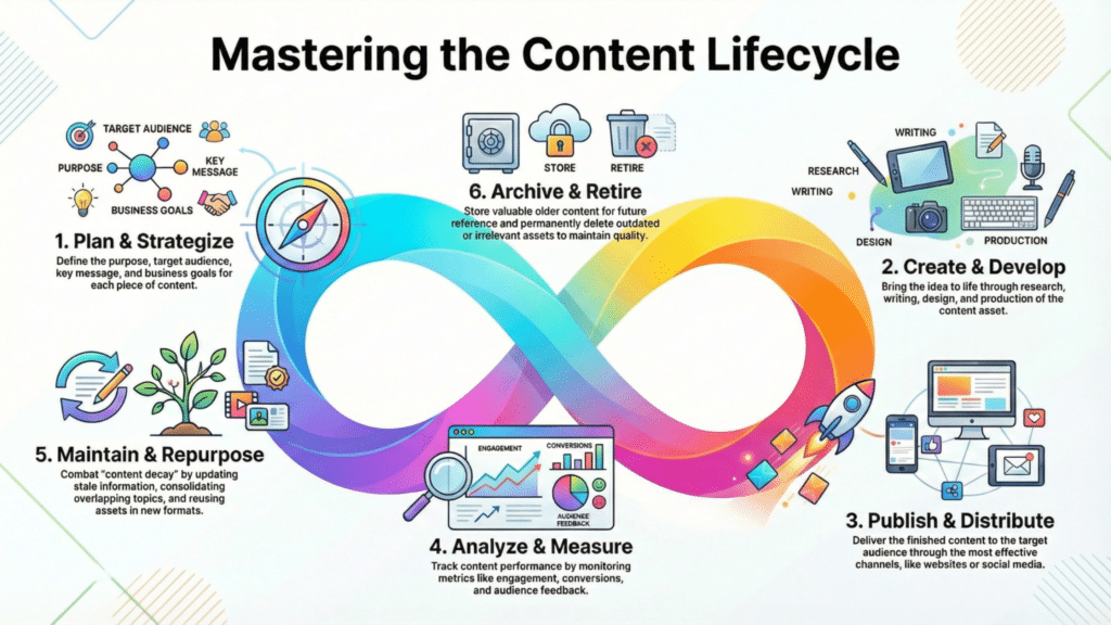
Many people treat content as “publish and forget.” A “Content Lifecycle” infographic visualizes content marketing as a circular loop rather than a linear finish line.
Key Takeaway: Ideation to Historical Optimization
- Ideation & Creation: The starting point, fueled by keyword research data.
- Promotion: The distribution phase, showing arrows pointing to social media, email newsletters, and outreach.
- Analysis: Measuring performance using metrics like time-on-page and bounce rate.
- Update/Prune: This is the critical “loop” part of the infographic. It illustrates returning to old content (6-12 months later) to update facts, add new sections, and refresh the publish date. This “historical optimization” is often the highest-ROI activity in SEO, yet it is frequently ignored.
Infographic #6: User Experience (Core Web Vitals)
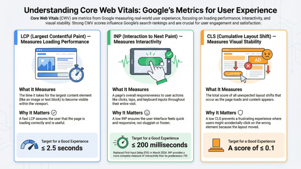
Google’s Core Web Vitals are technical metrics that measure user experience. Because they are acronym-heavy and abstract, a visual guide is the best way to understand them.
Key Takeaway: Visualizing Speed and Stability
This infographic breaks down the three pillars of page experience:
- LCP (Largest Contentful Paint): Visualized as a stopwatch measuring how fast the main content (like a hero image or headline) loads. A “green” score is usually under 2.5 seconds.
- FID (First Input Delay) / INP (Interaction to Next Paint): Visualized as a finger tapping a button. It measures responsiveness does the site freeze when you try to click?
- CLS (Cumulative Layout Shift): Visualized as a webpage jumping around. We have all experienced trying to click a link, only for an ad to load and push the text down, causing us to click the wrong thing. This metric measures visual stability.
Part 3: Authority & Technical (Advanced Visuals)
As you scale, you face advanced challenges: building authority and managing technical health. These visuals simplify the most intimidating parts of SEO.
Infographic #7: The Link Building Pyramid
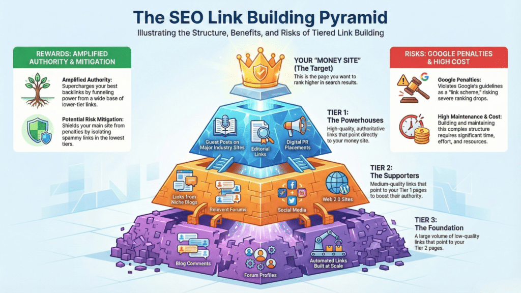
Link building is risky if done incorrectly. The “Link Building Pyramid” helps you visualize the quality hierarchy of backlinks so you don’t waste time (or risk penalties) on bad strategies.
Key Takeaway: Quality Over Quantity
- The Base (Foundational Links): These are safe, standard links from social media profiles, business directories, and citations. They provide a base level of trust but don’t skyrocket rankings.
- The Middle (Contextual Links): These are links from guest posts, resource pages, or partner sites. They are valuable and relevant.
- The Peak (Earned Editorial Links): The top of the pyramid represents the gold standard links from major publications (like The New York Times or industry leaders) that reference your content naturally because it is data-rich or unique. These are the hardest to get but have the highest impact on domain authority.
- The “Underground” (Spam): Often depicted outside the pyramid or in red, these are paid link schemes and private blog networks (PBNs) that Google penalizes.
Infographic #8: Local SEO Ecosystem
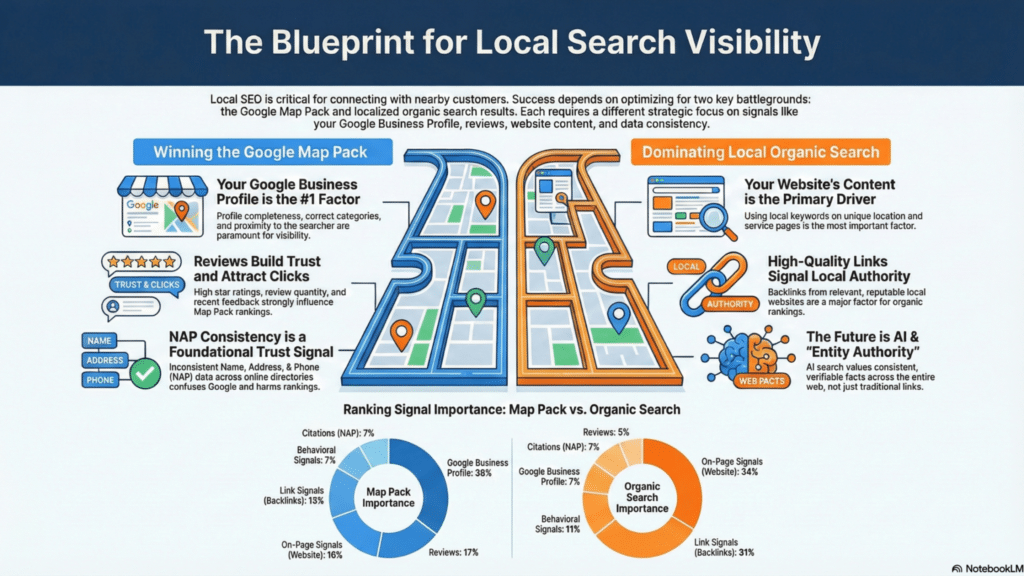
For local businesses, SEO looks different. The “Local SEO Ecosystem” infographic shows how your physical location data feeds into the search results.
Key Takeaway: Consistency is King
This visual usually centers on the Google Business Profile (GBP) as the sun in the solar system, with other factors orbiting it:
- NAP Consistency: The visual emphasizes that your Name, Address, and Phone number (NAP) must be identical across every directory (Yelp, Yellow Pages, Facebook). Conflicting data confuses Google’s algorithm.
- Reviews: Arrows connect customer feedback directly to ranking visibility. The quantity and velocity of reviews matter.
- Proximity: A map layer shows that searcher location is a primary ranking factor you rank higher for users physically closer to your office.
Infographic #9: Technical SEO Audit Checklist
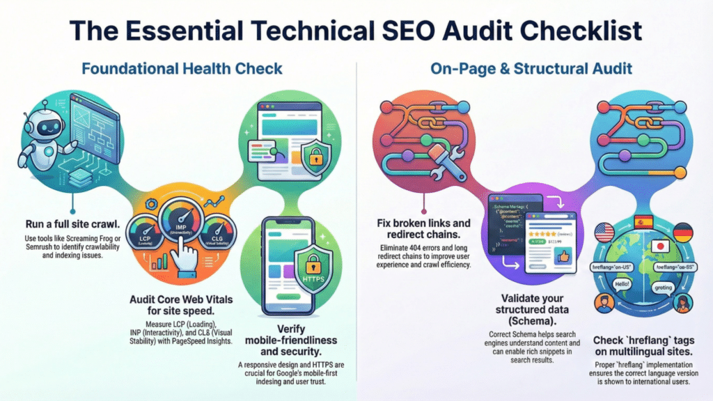
Technical SEO is effectively a health check for your website. A “Checklist Infographic” turns a complicated audit into a simple “Red Light / Green Light” system.
Key Takeaway: Scan-Friendly Technical Health
Instead of reading through code, this infographic groups technical tasks:
- Crawlability: Is the
robots.txtfile blocking important pages? Is the XML sitemap updated? - Security: Is there a padlock icon (SSL certificate/HTTPS) present?
- Mobile-Friendliness: The visual reminds you to check if elements overlap or are too small on mobile screens.
- Duplicate Content: It highlights the need for “Canonical Tags” a piece of code that tells Google which version of a page is the “master” copy to avoid self-competition.
Infographic #10: Voice Search vs. Desktop Search
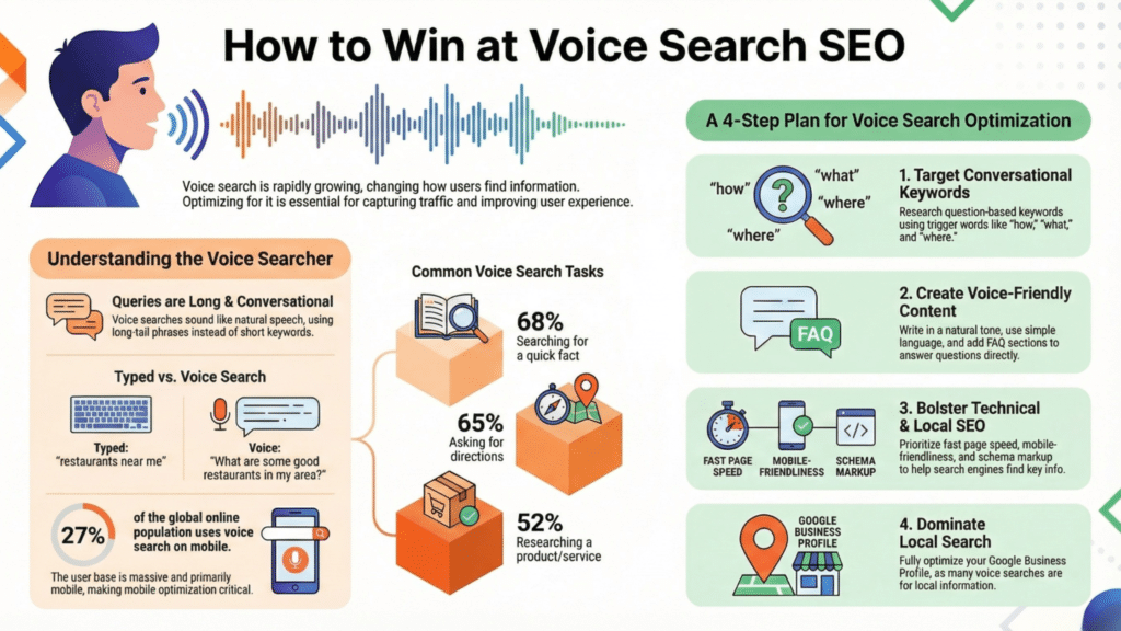
As search habits evolve, so do keywords. This infographic contrasts how we type versus how we speak.
Key Takeaway: NLP and Conversational Queries
- Desktop/Type: The visual shows short, choppy keywords. Example: “weather NYC.”
- Voice/Mobile: The visual shows long, complete sentences. Example: “What is the weather like in New York City right now?”
- The Shift: This comparison teaches marketers to target “Long-Tail Keywords” and question-based phrases. Voice search results often come from “Featured Snippets” (the answer box at the top of Google), so the infographic highlights the importance of concise, direct answers within your content to win that spot.
How to Use These SEO Infographics for Your Own Site
Now that you have mentally visualized these concepts, how do you actually apply them? You don’t need to be a graphic designer to get value from SEO infographics. Here are three ways to leverage them for growth.
Tip 1: Use Them as Audit Checklists
Print out the “Anatomy of a Perfectly Optimized Page” or the “Technical Audit Checklist.” Go through your top 10 landing pages one by one. Does the H1 match the Title Tag? Is the URL clean? Use the visual as a physical scorecard. It is much harder to miss a step when you are following a visual map than when you are relying on memory.
Tip 2: Share and Earn Backlinks
We discussed the “Link Building Pyramid” earlier SEO Infographics are one of the best ways to reach the peak of that pyramid. Other websites love to embed high-quality visuals because they break up text and add value to their own readers.
- Action Plan: Create your own version of a complex concept (like “The State of SEO in Your Industry”). Publish it, then reach out to other bloggers. Offer them the infographic to use in their posts for free, asking only for a credit link back to your site. This is a proven strategy for earning high-authority backlinks.
Tip 3: Master Image SEO
If you are publishing SEO Infographics, you must practice what you preach regarding Image SEO. Google cannot “read” pixels perfectly yet.
- File Names: Never upload
IMG_5432.jpg. Rename it tokeyword-research-funnel-infographic.jpg. - Alt Text: Write a descriptive sentence for screen readers and search bots. For example: “A funnel diagram showing the three stages of keyword intent: awareness, consideration, and conversion.”
- Compression: Large visual files can slow down your site (hurting your Core Web Vitals). Always compress your SEO Infographics using tools like TinyPNG or WebP format before uploading.
FAQs
What are SEO infographics?
SEO infographics are visual tools designed to simplify complex search engine optimization concepts. They make it easier to understand strategies like on-page SEO, link building, and keyword research.
How can SEO Infographics improve SEO understanding?
SEO Infographics break down technical topics into digestible visuals, making it easier for teams and clients to grasp SEO strategies and their benefits. They are also great for engaging audiences and encouraging knowledge retention.
Are these SEO Infographics up-to-date for 2026?
Yes! The curated SEO Infographics in this guide reflect the latest SEO trends and techniques to help you stay ahead in rankings.
Who can benefit from using these SEO infographics?
Anyone looking to understand or explain SEO concepts can benefit from these SEO Infographics, including marketers, content creators, SEO professionals, and business owners.
Where can I find these SEO infographics?
You can access and download the SEO Infographics directly from our curated guide or through the links provided in each section of the article.
Visualizing Success in 2026
SEO is not a black box; it is a system. When you strip away the jargon and look at the underlying architecture – the pipelines, the pyramids, and the funnels – the path to ranking #1 becomes much clearer.
Visualizing data makes complex strategies actionable. Whether you are auditing your technical setup or planning your content calendar, referring back to these mental models will keep your strategy grounded. The algorithms will continue to change, but the foundational structures represented in these SEO Infographics – relevance, authority, and user experience – will remain constant.

